Fast Unsupervised Image Categorization Algorithm

In this post, I’m going to show how we can combine the image feature recognition algorithm I presented a few months ago, with the categorization and prediction algorithms I presented in the two posts below, to produce an algorithm that can quickly categorize images, without any supervision. The final algorithm I’ll present is O(n), where n is the number of pixels in the image we’re attempting to categorize.

This algorithm works so well that it can distinguish between paintings by different artists, in just a few seconds. It can also distinguish between articles of clothing, and other objects, but the focus of this post will be on its ability to distinguish between artists, because, in my opinion, this shows that the algorithm is capable of unsupervised abstraction, allowing it to say without any guidance, what it is that distinguishes a Van Gogh from a Caravaggio.

These algorithms use the same underlying categorization and prediction algorithms that I used below to imitate complex three-dimensional shapes, predict data, and approximate complex functions. In this case, I’ve added some additional scripts that allow the underlying algorithms to analyze images. As a result, the underlying categorization and prediction algorithms are shaping up to be a set of generalized AI algorithms that appear to only require a “hook” into the subject matter in question.

Finally, note that all of the algorithms I’ll present in this post are worst-case polynomial in time as a function of the number of pixels in the image. That is, even the algorithms we’ll use to construct categories in the first instance are polynomial in time as a function of the number of pixels / images in the database. As a result, these algorithms allow for what I believe to be industrial quality image recognition to be implemented on a consumer device, and can probably allow industrial machines to conduct real-time analysis of high-resolution video.

Summary of the Underlying Image Feature Identification Algorithm

In the post below entitled, “Image Recognition with no Prior Information”, I presented an algorithm that can quickly identify features within an image, without any prior information about the image, or the categories to which the image might belong. At a high level, this algorithm takes an image, and partitions it into objectively distinct features. But because the algorithm operates with no prior information at all, it isn’t looking for a particular object, but is instead looking for every objectively distinct feature within an image. In short, this first algorithm attempts to identify all of the features within an image, but because this algorithm has no prior information, it can’t say what these features are, but can nonetheless identify them as distinct from one another. As a result, this algorithm is only the first step of the image processing algorithms I’ll present in this post.

Like all of the other work that is part of this project, the feature recognition algorithm is rooted in information theory, and operates based upon the assumption that objectively distinct features within an image will contain different amounts of information. Specifically, the feature identification algorithm subdivides an image in a way that maximizes the difference in the amounts of information contained in each subdivision of the image. I call each subdivision of an image generated by the algorithm a region. Though it might seem pedantic to distinguish between a region and a feature, I’d like to reserve the term feature to denote an actual feature of an image, as identified by a human, whereas a region is a portion of an image identified by the algorithm that should contain a feature.


The first, second, and third attached images are examples of an image that has been processed by the algorithm. The first image is a photo I took in Lake Como, Italy, and the second image shows the original image after being processed, with the brightness of each region adjusted by the algorithm to reflect how likely it thinks the region is to be part of the foreground of the image. The brighter a given region is, the more likely the algorithm thinks that the region is part of the foreground of the image. You can get a sense of how the algorithm partitions an image by looking at the boundaries of the regions in the second image. The third image shows a specific region identified by the algorithm, which is in this case an individual standing on a diving board, which can be found around the center of the original image.

You can do this yourself using the following code:

pkg load communications

pkg load image

I = imread(“[IMAGE FILE]”);

[region_matrix N S_mat prob_mat] = identify_features(I);

imshow(ent_contrast_darken_file(I,N,region_matrix, prob_mat));

figure, imshow(extract_region(I,N,region_matrix,27));

Constructing a Tractable Color Palette

At a high level, the technique we’ll employ is straightforward: first we’re going to partition an image using the feature identification algorithm described above, and that’s going to produce a series of regions, which should correspond to features within the image. Then, we’re going to calculate the average color of each region, which will create a dataset of average colors. Then, we’re going to categorize those colors using the vector categorization algorithm I presented in the two posts just below this one.

In this section, I’ll walk through applying this process to a single image. In the next section, we’ll apply it to a series of images. In the last section, I’ll present a vectorized implementation of this entire process that will allow us to categorize new images using an algorithm that is O(n).

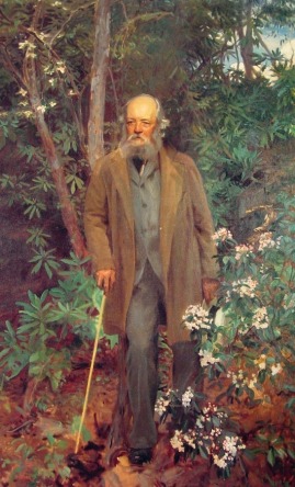
I’ve attached a photograph of one of Van Gogh’s iconic self-portraits that we’ll use as our first subject.

3

First, we’ll count the number of unique colors in the image using a vectorized script I found on Matlab’s website, written by Steve Eddins, which is available here:

https://blogs.mathworks.com/steve/2008/01/31/counting-occurrences-of-image-colors/

I = imread(“[IMAGE FILE]”);

rgb_columns = reshape(I, [], 3);

[unique_colors, m, n] = unique(rgb_columns, ‘rows’);

color_counts = accumarray(n, 1);

size(unique_colors, 1)

The image contains 184064 unique colors, and since the image contains 768*608 = 466944 pixels, about 40 percent of the pixels contain unique colors. As a result, the image contains a very rich color palette, and therefore, quite a lot of color information for its size. Nonetheless, a human observer probably wouldn’t have much trouble quickly describing the color palette of the painting, which contains a lot of yellow, due to his large hat, with a pinkish and orange background, and some pale blues in his blazer.

This type of description is a form of compression, since we’ve taken a large amount of color information, and compressed that information into a tractable statement that is nonetheless a meaningful description of its subject. Similarly, the goal of this section will be to produce a compressed color palate that straddles the line the between a set of colors that is digestible by a human, and a set of colors that is useful to a machine. The color sets we’ll produce will be too large to be described in one sentence, but small enough to be expressed visually in a single color bar that can be quickly gleaned by a human. The intended end result is to have the categorization algorithm operate like an enhanced human, that quickly compresses information, but nonetheless has access to details that a human observer would find overwhelming.


Continuing with the example of the self-portrait, first we’ll run the feature identification algorithm, which will produce a set of matrices we can use to partition the image into regions. Then, we’ll run a script that calculates and stores the average color of each region, which will produce a dataset of color vectors. Finally, we’ll run the categorization algorithm on that dataset of color vectors, which will produce a core set of color vectors that can be thought of as forming a basis for the colors in the image. I call these basis vectors the anchors of their color categories, since the categorization algorithm treats each anchor vector as the geometric center of a category, meaning that all other vectors in the category defined by the anchor are within some distance, delta, that the algorithm calculates based upon a variety of factors that I explain in the two posts below this one.

All of this can be done using the following code:

[region_matrix N S_mat prob_mat] = identify_features(I);

figure, imshow(ent_contrast_darken_file(I,N,region_matrix,prob_mat));

data_array = calculate_average_feature_color(I,N,region_matrix, prob_mat, 0, 0);

[data_categories_array category_vec anchor_array H_final delta] = optimize_categories_3D(data_array,0);

color_bar_compressed = display_color_array(anchor_array, data_categories_array);

figure, imshow(color_bar_compressed)

The feature identification algorithm generates 94 regions, and the color bar shows the compressed set of colors generated by the categorization algorithm, which consists of 44 anchor colors. Visually, this set of colors is clearly representative of the underlying painting, despite containing only about .02% of the unique colors in the image. As a result, even though average color is generally a very lossy metric for an image, because we’ve taken the average color of what are objectively distinct features of the image, we’ve ended up with meaningful color information, while nonetheless achieving an enormous amount of compression. Not to boast, but this is actually quite remarkable, since the algorithm has taken over one hundred thousand colors from an image, and produced, without any supervision, a set of 44 colors that are perfectly representative of the underlying image. Moreover, it would almost certainly be impossible for a human to sift through all of the colors in the original image and select a comparable set of colors. At the same time, these are the colors that a human probably would select if they could. As a result, this process generates the same type of compression a human-generated, verbal summary achieves, but on a mechanized scale, and expressed nonverbally, in the form of an image. Interestingly, it also suggests that nonverbal summaries of this type could allow machines to convey complex information to their human counterparts.

This of course does not preclude more sophisticated measures from being used in lieu of average color. Instead, I’m presenting this as a simple example of a more generalized approach to image recognition that consists of three primary steps:

(1) identify the features of an image using the feature identification algorithm described above;
(2) analyze the properties of each resulting region, producing a metric;
(3) categorize the resulting metrics.

If our metric is visually meaningful, then the categories we’ll construct in step three will cause the metrics associated with similar looking features to be categorized together, thereby creating categories of similar looking features. It turns out that average color works quite well, though there are undoubtedly variations on this theme that might be more useful in other contexts.

Categorizing Images

By applying the process above to a category of similar images, we can construct a palette that is representative of an entire category of images. In this case, we’re going to construct two palettes: one generated by analyzing a series of paintings by Van Gogh, and another generated by analyzing a series of paintings by John Singer Sargent. These two painters worked with somewhat similar color schemes, and to a non-expert like myself, a superficially similar impressionistic style. Nonetheless, the paintings I’ve selected are distinguishable, and as a result, the two categories of paintings will produce different color palettes. We’ll analyze a set of 8 paintings by each artist, for a total of 16 images, each of which are attached as the last 16 images.

We can produce the palettes using the following code:

directory_path_A = “[Van Gogh]”;

directory_path_D = “[Sargent]”;

num_images_A = 8;

num_images_D = 8;

[category_tree1 delta_tree1 anchor_tree1 data_array1] = generate_single_path_img_data(directory_path_A, num_images_A);

[category_tree4 delta_tree4 anchor_tree4 data_array4] = generate_single_path_img_data(directory_path_D, num_images_D);

[data_categories_array1 category_vec1 anchor_array1 H_final1 delta1] = optimize_categories_3D(data_array1,0);

[data_categories_array4 category_vec4 anchor_array4 H_final4 delta4] = optimize_categories_3D(data_array4,0);

color_bar_compressed1 = display_color_array(anchor_array1, data_categories_array1);

color_bar_compressed4 = display_color_array(anchor_array4, data_categories_array4);

figure, imshow(color_bar_compressed1)

figure, imshow(color_bar_compressed4)

The Van Gogh set of images generates 711 features, ultimately compressed into a set of 268 anchor colors, while the Sargent set of images generates 600 features, which were compressed into a set of 243 anchor colors. Yet again, these algorithms achieve an incredible amount of compression, taking millions of colors in the underlying images, and generating a comparatively minuscule set of colors that a human being can easily observe and intuitively understand, albeit in a nonverbal manner.


The Van Gogh palette consists of an array of rich, and bright pastels, whereas the Sargent palette consists of what I thought to be a surprisingly dark set of colors, mixed in with brighter colors that are nonetheless closer to the grey portion of the spectrum when compared to the vibrant colors that make up the Van Gogh palette.

If we were to take yet another Van Gogh painting, and compare the color palette of that new painting to the Van Gogh palette we just produced, it would probably be a decent match. Moreover, the color palette of the new Van Gogh would almost certainly be a better match for the existing Van Gogh palette than the Sargent palette. As a result, if we’re given a new image, and we assume that the new image is either a Van Gogh or a Sargent, then by comparing the color palette of the new image to the two color palettes we just produced, we should be able to categorize that new image as either a Van Gogh or a Sargent.

The image categorization algorithm I’ll present in this section is O(n*log(n)), since we’ll need to run the feature identification algorithm on the new input image in order construct its color palette. In the next section, I’ll present a vectorized version of this algorithm that is O(n), that takes into account the color of every pixel in the image. As a result, the vectorized algorithm is not only faster, but it’s also more powerful, since it takes into account all of the color information within an image. Nonetheless, the intuition and inspiration for the vectorized algorithm comes from this longer form process.


Let’s begin by generating a color palette for the beardless Van Gogh self-portrait, which I’ve attached, using the same code above from the previous section. Though this image was not part of the database that generated the Van Gogh palette, just looking at it, we can already see that it’s probably going to fit well. Not surprisingly, the resultant color palette looks a lot like a subset of the color palette for the entire Van Gogh series. As a result, it makes sense to assume that this set of colors will be a better fit for the Van Gogh palette than for the Sargent palette.

We can test this hypothesis using a prediction function I presented in the previous post, that takes a new data item, and attempts to categorize it into an existing dataset that’s already been analyzed using the categorization algorithm. At a high level, what the prediction algorithm does is attempt to place the new data item into an expanded set of anchor vectors that are structured as a tree. If it can place the new data item somewhere in the tree, then the new data item is a good match for the dataset. If it fails to place the new data item in the tree, then the new data item is not a good match for the dataset. For a full explanation as to how and why the prediction algorithm works, see the two posts just below this one.

In this particular case, we can think of the prediction algorithm as attempting to fit each new feature color into an existing dataset of anchor colors. The greater the number of feature colors that match with a given dataset of anchor colors, the more confident we can be that the new image is, as a whole, a match for that dataset in terms of its color palette. Of course, knowing that two images have similar color palettes is not, as a general manner, enough information to conclude that the two images belong to the same category of images or objects. But in this case, we’re tacitly assuming that the painting is either a Van Gogh or a Sargent, and then determining to which category the painting belongs by comparing a compressed representation of its color palette to the Van Gogh and Sargent palettes we just compiled.

This can be done using the following code:

[region_matrix N S_mat prob_mat img_data_array score_vector1 delta_vector1] = AB_test_image(I, category_tree1, anchor_tree1, delta_tree1);

[region_matrix4 N4 S_mat4 prob_mat4 img_data_array4 score_vector4 delta_vector4] = AB_test_image(I, category_tree4, anchor_tree4, delta_tree4);

sum(score_vector1 != Inf)

sum(score_vector4 != Inf)

In short, the underlying prediction algorithm will attempt to place the average color of each region from the new image into each dataset. If it succeeds, it will return a score of 0, and if it fails, it will return a score of Inf, which indicates that the algorithm thinks that the new color doesn’t belong to the dataset. The last two lines of code count how many regions matched with the two datasets. In this case, the new Van Gogh matched with the Van Gogh dataset 50 times, and matched with the Sargent dataset 40 times. Each test involved attempting to place 80 regions, meaning that in both cases, a significant number of regions failed to categorize.

Though this approach works reasonably well, note that it tests whether the average color of an entire region is a good fit for the color palette in question. As a result, the test does not take into account the vast majority of color information in an image, since each region is going to contain a large number of pixels. In the next section, we’ll vectorize this algorithm, which will allow us to quickly test every pixel in an image, thereby creating a simple filter that can test whether the colors in an image fit well within the complex, and discontiguous sets of colors that comprise the palettes we’ve constructed. Ultimately, this will allow us to quickly categorize images using a simple filtering process.

Vectorized Image Categorization

The first three steps in the process above cannot, to my knowledge, be vectorized. That is, if we want to construct a color palette for a database of images, we need to run the feature identification algorithm, calculate the average color of each resulting feature, and then categorize the resulting dataset of colors. However, if we’d like to compare the colors within an image to that color palette, after it’s already been produced, then we can take advantage of the ready-baked vectorized procedures of Matlab and Octave, and possibly other languages as well.

In short, what we’ll do is simply test whether each pixel in an image is roughly within delta of at least one anchor color. If the pixel is within delta of some anchor, then it will pass the filter. If it is not within delta of some anchor, then it will not pass the filter. By calculating the percentage of pixels that survive filtration using this method, we can measure what percentage of pixels in the image are a match for the color palette in question. This in turn allows us to quickly determine to which category of images a given input image belongs, by choosing the category associated with the filter that had the highest pixel survival rate. That is, the input image is best suited in terms of color with the underlying category of images that generated the filter that does the least damage.

For example, if we’d like to determine whether a given image is a Van Gogh or a Sargent, we can use the color palettes we generated above, and test that new image using a Van Gogh filter and a Sargent filter. The filter with the higher pixel survival rate is the better fit, and therefore tells us which of the two painters is most likely to have held the brush.

Returning to the beardless Van Gogh portrait we tested above, we can apply a Van Gogh filter and a Sargent filter to that image using the following code:

%the Van Gogh filter

[not_mask mask] = generate_category_mask(I, anchor_tree1, delta_tree1);

I_Post = I.*mask;

figure, imshow(I_Post)

num_on_pixels = sum(mask(:) == 1);

[row col x] = size(I);

num_pixels = row*col;

survival_rate1 = num_on_pixels/num_pixels

%the Sargent filter

[not_mask mask] = generate_category_mask(I, anchor_tree4, delta_tree4);

I_Post = I.*mask;

figure, imshow(I_Post)

num_on_pixels = sum(mask(:) == 1);

[row col x] = size(I);

num_pixels = row*col;

survival_rate4 = num_on_pixels/num_pixels

The survival rate for the Van Gogh filter is 0.29383, or roughly 30% of the pixels, whereas the survival rate for the Sargent filter is 0.13676, or roughly 14% of the pixels.

As a general matter, this approach works astonishingly well, and gives wide margins of survival rates even in cases like this, where we’re distinguishing between similar images that are, frankly, difficult for even some humans to categorize. For example, if we’d like to A/B test for whether an image contains one of two dresses, then this approach will work, assuming that the two dresses have objectively distinct color palettes, even if they’re superficially quite similar to a human observer. Since this approach is not necessarily restricted to color, I believe this algorithm could mark the beginning of an entirely new approach to image recognition.

Octave Scripts:

display_color_array

ab_test_image

ret_avg_color_vec

calculate_average_feature_color

generate_single_path_img_data

generate_category_mask

find_bg_color
find_max

gather_regions_delta

gen_inf_prob_matrix

generate_s_mat_distribution

identify_features

inf_weighted_prob

left_right_delta

local_test

mw_sq_std_dev

score_image

spec_log

test_measures

find_most_distant_pair

generate_categories_3d

generate_data_space

left_right_delta_3d

optimize_categories_3d

partition_array_3d

partition_array_3d_bigly

spec_log

test_entropy_array_3d

vector_entropy

predict_best_fit_tree

generate_data_tree

extract_region

ent_contrast_darken_file


Fast Numerical Function Approximation

In a previous post, I introduced an extremely fast prediction algorithm that appears to have an average run time complexity of significantly less than O(log(n)), where n is the number of data points in the underlying data set. In this post, I’m going to show how this algorithm can also be used as a fast and generalized method for numerical function approximation, regardless of the function’s type and complexity.

Unlike interpolation methods, this algorithm does not attempt to approximate the underlying function using continuous functions. Instead, the algorithm is rooted in assumptions derived from information theory that allow it to work with the natural domain and range of the underlying function, facilitating extremely precise approximations of a wide variety of smooth, and discontinuous functions, all under one umbrella algorithm.

In this post, I’m going to explain how you can use the algorithm to approximate any function you’d like, and I’ll also present some data that demonstrates its performance and precision. For a theoretical explanation as to why this algorithm works, see the post below entitled, “Predicting and Imitating Complex Data Using Information Theory”. In a follow up post, I’ll show how we can combine this algorithm with my image partition algorithm to construct a fast, unsupervised image recognition algorithm.

How to Use the Algorithm

The only thing you need in order to use the algorithm is a dataset of Matlab / Octave vectors containing the X, Y, and Z values of your function in three separate vectors.

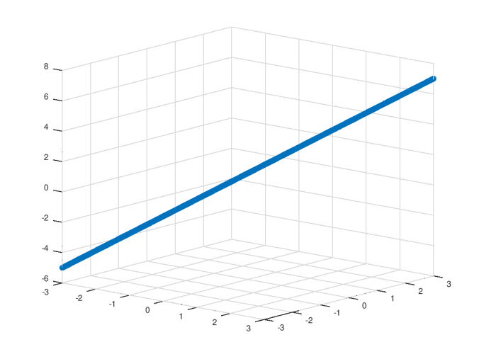
I’ll give some more examples below that make use of noisy data to demonstrate the versatility of the algorithm, but let’s begin with the simple linear function z = x + y + 1, evaluated along the line y = x, over the interval [-3,3].

First, we generate the x,y, and z vectors using the following code:

pkg load image
pkg load communications
clear x y z
x = -3 : .012 : 3;
y = -3 : .012 : 3;
z = x .+ y .+ 1;
figure, scatter3(x,y,z)
view(70,15)

linear-original

The x and y vectors contain the domain values of the function we’d like to approximate, and the z vector contains the corresponding range values of the function. In this case, we’re approximating the function z = x + y + 1, but you could of course choose any function you’d like, whether or not it has a closed form expression, so long as the data is represented as three separate column vectors.

Once we’ve generated the data for the function we’d like to approximate, we can instruct the algorithm to process the data, generating a set of data trees that it will ultimately use to approximate the function.

This step is done using the following code:

data_array = shape_to_data(x,y,z);
[category_tree delta_tree anchor_tree] = generate_data_tree(data_array);

This is by far the most time-consuming part of the algorithm, but it is nonetheless polynomial in time as a function of the number of data points. Moreover, it’s something we’ll only need to do once, since this is the part of the algorithm that actually constructs our approximating function.

At a very high level, what the algorithm does is construct a data tree that can be used to approximate the underlying function at certain key locations within the domain of the function that are selected by the algorithm using assumptions rooted in information theory. New points in the domain that are subsequently fed to the algorithm are then quickly mapped into the data tree, resulting in very fast and very accurate function approximations.

In the previous post, I showed that this method is so accurate that it can reproduce complex three-dimensional objects it has analyzed when subsequently given random inputs, since the algorithm can quickly discern between new data points that belong to the data set / object, and data points that do not.

Continuing with our example above, let’s begin by approximating the underlying function at the point (x,y) = [2.5 2.5], and compare it to the result given by the original function.

This is done using the following code:

new_data_item{1} = [2.5 2.5 0];
[category_index predicted_z final_delta] = predict_best_fit_tree(anchor_tree, delta_tree, new_data_item, 1, 1);

In short, the algorithm takes the new data point (x,y) = [2.5 2.5], and attempts to place it into the data tree constructed from the domain and range of the underlying function.

In this case, we have,

predicted_z = 5.9920;

The original function gives a value of z = 2.5 + 2.5 + 1 = 6, for an error of approximately 0.008.

The last two arguments to the function are toggles that determine how the prediction algorithm behaves. The first toggle tells the algorithm to ignore the input z-value, but I nonetheless always use a z-value of 0 for consistency. The second toggle must be -1, 0, or 1, and determines how much time is spent searching the data tree for a good fit for the input. In this case, I’ve set the toggle to 1, which instructs the algorithm to search the entire data tree for the absolute best fit possible, in order to maximize the precision of our approximation. This of course increases the run time of the algorithm, but since we’re trying to approximate a function, precision takes precedence, especially given that the algorithm is still very fast.

If instead we set the toggle to -1, then we have,

predicted_z = 6.0400.

If we set the toggle to 0, then we have,

predicted_z = 5.9920.

As I mentioned above, this algorithm can also be used to imitate complex three-dimensional shapes, which requires a much higher volume of random inputs, in which case it might be advantageous to quickly process a large number of new data points approximately, rather than spend the incremental time required for greater precision. If you’d like to do that, simply set the toggle to -1 for the fastest placement and lowest precision, or to 0, for intermediate speed and intermediate precision.

Now let’s test the accuracy of the prediction over a large number of points that were not part of the original domain. The original domain had an increment of .012, so we’ll double the number of points by using an increment of .006, to ensure that we’re testing the algorithm at points in the domain that it didn’t evaluate previously, using the following code:

clear prediction_vector error_vector x y z
search_toggle = 1;
cnt = 1;
x = -3 : .006 : 3;
y = i = -3 : .006 : 3;
[temp num_data_points] = size(x);
tic;
for i = 1 : num_data_points
new_data_item{1} = [x(i) y(i) 0];
z(i) = x(i) + y(i) + 1;
[category_index predicted_z final_delta] = predict_best_fit_tree(anchor_tree, delta_tree, new_data_item, 1, search_toggle);
prediction_vector(i) = predicted_z;
error_vector(i) = z(i) – predicted_z;
endfor
toc
figure, scatter3(x,y,z)
view(40,15)
figure, scatter3(x,y,prediction_vector)
view(40,15)

linear-approx

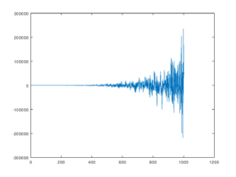
Superficially, the two plots look very similar, so let’s plot the errors and have a look at some related statistics:

figure, plot(1:num_data_points, error_vector)
std(abs(error_vector(:)))
mean(abs(error_vector(:)))
mean(abs(error_vector(:)))/mean(abs(z(:)))

linear-error

In this case, the errors have an average absolute value of 0.012659, and are generally tightly bounded, though they are clearly not continuously distributed, since again, the algorithm does not use any type of smooth approximation, but instead makes use of a discrete data tree.

Now let’s apply the algorithm to a discontinuous, noisy sine wave function generated by the following code:

clear x y z
cnt = 1;
for i = 0 : .0125 : 3*pi
x(cnt) = i + .25*rand();
y(cnt) = i + .25*rand();
z(cnt) = sin(x(cnt));
cnt = cnt + 1;
endfor
figure, scatter3(x,y,z)
view(70,15)
data_array = shape_to_data(x,y,z);
[category_tree delta_tree anchor_tree] = generate_data_tree(data_array);

sine-original

This is a sine wave with a noisy domain around the line y = x, over the interval [0,3*pi]. Since this will create a patchy domain and range, we’ll need to actually monitor the instances where the algorithm fails to map an input to the data tree. We do this by including a conditional that tests for whether the algorithm returns a predicted_z of infinity, which is how the algorithm signals that it thinks that an input is outside of the original domain of the function.

This can be done using the following code:

clear prediction_vector error_vector x y z
search_toggle = 1;
cnt = 1;
fail_count = 0;
x = 0 : .00625 : 3*pi;
y = 0 : .00625 : 3*pi;
[temp num_data_points] = size(x);
tic;
for i = 1 : num_data_points
x(cnt) = x(cnt) + .25*rand();
y(cnt) = y(cnt) + .25*rand();
z(cnt) = sin(x(cnt));
new_data_item{1} = [x(cnt) y(cnt) 0];
[category_index predicted_z final_delta] = predict_best_fit_tree(anchor_tree, delta_tree, new_data_item, 1, search_toggle);
if(predicted_z != Inf)
prediction_vector(cnt) = predicted_z;
error_vector(cnt) = z(cnt) – predicted_z;
cnt = cnt + 1;
else
fail_count = fail_count + 1;
endif
endfor
toc

We can generate the output and related statistics using the following code:

fail_count
x = x(1 : cnt – 1);
y = y(1 : cnt – 1);
z = z(1 : cnt – 1);
figure, scatter3(x,y,z)
view(40,15)
figure, scatter3(x,y,prediction_vector)
view(40,15)
figure, plot(1 : cnt – 1, error_vector)
std(abs(error_vector(:)))
mean(abs(error_vector(:)))
mean(abs(error_vector(:)))/mean(abs(z(:)))


In this case, it turns out the algorithm failed to place the new data 24 times, which is about 1.6% of the total number of data points. But, this can vary upon each run since the domain and range include some random noise. The average absolute error is about 0.027, with oscillating peaks that appear to follow the underlying function.

Finally, let’s apply the same technique to a polynomial with a noisy domain, also around the line y = x, using the following code:

clear x y z
cnt = 1;
for i = 1 : .009 : 8
x(cnt) = i + .25*rand();
y(cnt) = i + .25*rand();
z(cnt) = x(cnt)^7 + y(cnt)^7 + 10;
cnt = cnt + 1;
endfor
figure, scatter3(x,y,z)
view(40,15)
data_array = shape_to_data(x,y,z);
[category_tree delta_tree anchor_tree] = generate_data_tree(data_array);

poly-original

We can generate the approximation using the following code:

search_toggle = 1;
clear prediction_vector error_vector x y z
cnt = 1;
fail_count = 0;
x = 1 : .007 : 8;
y = 1 : .007 : 8;
[temp num_data_points] = size(x);
tic;
for i = 1 : num_data_points
x(cnt) = x(cnt) + .25*rand();
y(cnt) = y(cnt) + .25*rand();
z(cnt) = x(cnt)^7 + y(cnt)^7 + 10;
new_data_item{1} = [x(cnt) y(cnt) 0];
[category_index predicted_z final_delta] = predict_best_fit_tree(anchor_tree, delta_tree, new_data_item, 1, search_toggle);
if(predicted_z != Inf)
prediction_vector(cnt) = predicted_z;
error_vector(cnt) = z(cnt) – predicted_z;
cnt = cnt + 1;
else
fail_count = fail_count + 1;
endif
endfor
toc

And, finally, we can generate the graphs and error statistics using the following code:

fail_count
x = x(1 : cnt – 1);
y = y(1 : cnt – 1);
z = z(1 : cnt – 1);
figure, scatter3(x,y,z)
view(70,20)
figure, scatter3(x,y,prediction_vector)
view(70,20)
figure, plot(1 : cnt – 1, error_vector)
std(abs(error_vector(:)))
mean(abs(error_vector(:)))
mean(abs(error_vector(:)))/mean(abs(z(:)))


As you can see, in all three cases, the approximations are true to the original functions, both in terms of the domain and range values, with very small errors compared to the range values, despite the fact that the functions are clearly very different in nature.

Octave Scripts:

find_most_distant_pair

generate_categories_3d

generate_data_tree

left_right_delta_3d

optimize_categories_3d

partition_array_3d

predict_best_fit_tree

shape_to_data

test_entropy_array_3d

generate_data_space

vector_entropy

Predicting and Imitating Complex Data Using Information Theory

I’m going to present two prediction algorithms, one with a run time that is polynomial in the number of items in the underlying dataset, and another that is extremely fast, with an average case run time that appears to be significantly less than O(log(n)), where n is the number of items in the dataset.

I believe this second algorithm could turn out to be a powerful and novel tool in AI, since, in addition to accurately predicting data, it is so fast that it can quickly take an entire dataset, and reproduce it, regardless of the complexity of the original dataset. Another way to think about this is that this prediction algorithm is so good and so fast, that random inputs to the algorithm end up generating a new version of the original dataset, allowing it to expand the domain of a function, and in the extreme case, quickly imitate the structure of a three-dimensional object.

This is possible because these algorithms don’t attempt to interpolate data, and as a result, any inputs that don’t map well to the existing dataset are rejected. This allows us to provide the algorithm with random inputs, some of which will successfully map to the original dataset, which will accumulate over time, and eventually generate a new dataset that is similar to the original. Put in more formal terms, not only can this algorithm predict values in the range of a function, it can also reproduce and expand the domain of a function that it has analyzed.

I believe generalizations of this approach could yield even more impressive results in other areas of AI, beyond spatial pattern recognition. As a result, this is a long post that goes through all of the theory underlying the prediction techniques that allow these algorithms to work.

Categorizing Prior Data

The first step to both prediction algorithms is to use the categorization algorithm I presented below in the previous post entitled, “Fast N-Dimensional Categorization Algorithm”. When applied to a dataset, the categorization algorithm takes a dataset, and, as its name suggests, partitions it into a series of categories. In order to get a better sense of how the prediction algorithms work, I’ll briefly review how the categorization algorithm works.

In addition to categorizing data, the categorization algorithm will also produce two sets of variables: a single value called “delta”, and a series of values called “anchors”. Each category generated by the algorithm has an anchor, which is the data point about which the category is centered. That is, the algorithm searches through the dataset and finds a set of data points about which the dataset is clustered. Each anchor defines a category, since the data within each category is clustered around its anchor. We don’t have to specify how many categories / clusters the algorithm should produce ex ante. Instead, the algorithm decides on its own how many categories are appropriate in the context of the dataset.

As noted, each category is centered around an anchor value. Specifically, all of the vectors within a given category are within delta of the anchor for that category. That is, the norm of the difference between each vector within a given category and the anchor for that category is always less than delta. In short, delta is the natural, in-context distance between elements of the same category, based upon some assumptions rooted in information theory that I explain in the previous post below.

For example, assume we have the following dataset of 3-space vectors:

data_array{1} = [5.19858 0.61943 0.00000];
data_array{2} = [9.82500 3.40620 10.0000];
data_array{3} = [4.76372 0.20080 0.00000];
data_array{4} = [5.54710 9.43410 10.0000];
data_array{5} = [6.91330 2.81581 0.00000];
data_array{6} = [9.05740 9.94230 20.0000];
data_array{7} = [2.86459 5.11068 0.00000];
data_array{8} = [5.99046 0.26573 0.00000];

The categorization algorithm can be applied to this dataset using the following code:

[data_categories_array category_vec anchor_array H_final delta] = optimize_categories_3D(data_array,0);

Application of the categorization algorithm to this dataset yields the following categorization:

data_categories_array =
{
[1,1] =

5.19858 0.61943 0.00000

[1,2] =

4.76372 0.20080 0.00000

[1,3] =

6.91330 2.81581 0.00000

[1,4] =

2.86459 5.11068 0.00000

[1,5] =

5.99046 0.26573 0.00000

}

[1,2] =
{
[1,1] =

9.82500 3.40620 10.00000

}

[1,3] =
{
[1,1] =

5.54710 9.43410 10.00000

}

[1,4] =
{
[1,1] =

9.05740 9.94230 20.00000
}

That is, the algorithm divides the dataset into four categories, which appear to be most sensitive to the z-value of the data in this case. The first category contains 5 elements, and the remaining three categories each contain a single element. Note that the anchors generated by the algorithm are returned in the anchor_array, and in this case, the anchor for the first category is [5.19858 0.61943 0.00000]. The value of delta produced by the algorithm is 5.0711. As a result, all of the vectors in the first category are within delta of the first anchor vector, which you can check by taking the norm of the difference between the anchor and any vector in the first category. Note that applying the algorithm generates a single value of delta for all four categories.

In short, all vectors in the same category are within delta of the category’s anchor. As a result, though the goal of the algorithm is to generate categories, we can recharacterize the algorithm as generating a set of anchors, and a single value of delta, which will together define the categories it ultimately produces. That is, if I identify certain vectors within a dataset as anchors, and specify a value of delta, then I’ve defined a categorization of the dataset. We will use this fact later on to construct the “fast” prediction algorithm that looks only to the anchors and the value of delta. But first, we’ll begin with some assumptions and observations rooted in information theory that will inform our “full” prediction algorithm, which we’ll then approximate with the fast algorithm.

Categorization, Structure, and Entropy

The fundamental observation underlying nearly all of the work in AI that I’ve presented in this project is that if we want to find the “natural” structure of some artifact without any prior information, then we first represent the artifact as a mathematical object capable of producing a measure of entropy, such as a vector, matrix, graph, or set of probabilities, and then repeatedly partition that representation until we find the point where the entropy of the partition changes the most. That is, we take the object, and iteratively partition it into smaller and smaller objects, which will affect our measurement of the object’s entropy. During this process, there’s going to be a level of subdivision where the structure of the partitioned object will “crack”, producing the maximum rate of change to the entropy of the partition, thereby uncovering the actual structure of the artifact which the object represents.

For an intuitive, visual explanation of how and why this process works, see the post below entitled, “Image Recognition with no Prior Information”.

Turning this view on its head, we can measure how well a new data point fits into an existing dataset by measuring how much the entropy of the categorization changes after inclusion of the new data point. That is, if a new data point is a good fit for a dataset, then it shouldn’t disturb the existing category structure much, resulting in a low change to the entropy of the category structure. In contrast, if a new data point is a bad fit for a dataset, then it will significantly disturb the structure of the categories, resulting in a large change to the entropy of the category structure.

Continuing with the example above, assume we’re given the following new data point:

data_array{9} = [5.19858 0.62000 0.00000];

This is obviously very close to the anchor of the first category, and as a result, it’s reasonable to view this data point as a good fit for the existing dataset. To test whether this is actually the case, we insert this new data point into the dataset, and then rerun the categorization algorithm on the resulting dataset. Because we’re rerunning the categorization algorithm, it is possible for the anchors to change. As a result, we can’t predict to which category the new data point will belong, since those categories could change as a result of the inclusion of the new data point. Instead, we measure how well the new data point fits by measuring how much the entropy of the categorization changes as a result of its inclusion.

The entropy of the categorization is calculated by taking the number of data points in each category, and dividing each by the total number of data points, which will produce a probability for each category. We then take the entropy of this set of probabilities as if it represented an actual probability distribution.

In this case, as expected, the new data point does not change the category structure significantly, and instead, the new data point is categorized together with what was the anchor for the first category in the prior run, producing the following category structure.

data_categories_array =
{
[1,1] =
{
[1,1] =

5.19858 0.61943 0.00000

[1,2] =

4.76371 0.20080 0.00000

[1,3] =

6.91329 2.81581 0.00000

[1,4] =

2.86458 5.11067 0.00000

[1,5] =

5.99046 0.26573 0.00000

[1,6] =

5.19858 0.62000 0.00000

}

[1,2] =
{
[1,1] =

9.82500 3.40620 10.00000

}

[1,3] =
{
[1,1] =

5.54710 9.43410 10.00000

}

[1,4] =
{
[1,1] =

9.05740 9.94230 20.00000

}

}

The first category contains 6 elements, and the remaining 3 categories each contain 1 element. As a result, the entropy of the categorization is given by the following:

H = (6/9)*log2(9/6) + 3*((1/9)*log2(9)) = 1.4466.

The entropy of the original categorization is 1.5488. As a result, the change to the entropy of the categorization is in this case small, and negative, -0.10218, since the new data item increases the size of the first category, concentrating more of the data into a single category, and in turn reducing the entropy of the categorization (note that entropy is minimized when one category contains all of the data points).

Now assume that we are given the following new data point:

data_array{9} = [9.83000 3.40700 10.10000];

This is very close to the only vector in the second category, and as a result, this new data point should also be a good fit for the existing data. However, it’s not a good fit for the largest category, but is instead a good fit for a small category. In some sense, this implies that it’s actually not as good of a fit as the first new data point we considered above, since this new data point is similar to only one existing data point, as opposed to being similar to a large number of existing data points.

Application of the categorization algorithm produces the following:

data_categories_array =
{
[1,1] =
{
[1,1] =

5.198583 0.61943 0.00000

[1,2] =

4.76372 0.20080 0.00000

[1,3] =

6.91330 2.81581 0.00000

[1,4] =

2.86459 5.11068 0.00000

[1,5] =

5.99046 0.26573 0.00000

}

[1,2] =
{
[1,1] =

9.82500 3.40620 10.00000

[1,2] =

9.83000 3.40700 10.10000

}

[1,3] =
{
[1,1] =

5.54710 9.43410 10.00000

}

[1,4] =
{
[1,1] =

9.05740 9.94230 20.00000

}

}

As expected, the category structure is not disturbed, and instead, the new data point is inserted into the same category as the existing data point to which it is most similar. In this case, the change in entropy is small, and positive, 0.10895, since the new data point increases the size of a small category, thereby increasing the entropy of the categorization (note that entropy is maximized when all categories contain an equal number of data points). In this case, the magnitude of the change in entropy is greater than it was in the previous example, which is consistent with our observation that while the new data point is certainly a good fit, it is not as a good of a fit as the first example we considered above.

Now assume that we’re given the following data point:

data_array{9} = [45.15000 16.80000 4.90000];

This data point is probably not a good fit for the existing data, as its distance from any anchor is significantly larger than delta. As a result, we should expect the inclusion of this new data point to disturb the category structure.

Application of the categorization algorithm produces the following:

data_categories_array =
{
[1,1] =
{
[1,1] =

5.19858 0.61943 0.00000

[1,2] =

9.82500 3.40620 10.00000

[1,3] =

4.76372 0.20080 0.00000

[1,4] =

6.91330 2.81581 0.00000

[1,5] =

2.86459 5.110678 0.00000

[1,6] =

5.99046 0.26573 0.00000

}

[1,2] =
{
[1,1] =

5.54710 9.43410 10.00000

[1,2] =

9.05740 9.94230 20.00000
}

[1,3] =
{
[1,1] =

45.15000 16.80000 4.90000

}

}

In this case, the change in entropy is significant, and negative, -0.32440, as the new data point forced the existing data into a smaller number of larger categories. Put informally, in the context of the new data point, the rest of the data seems closer together, and as a result, the categorization algorithm increases the value of delta, which is in this case 11.902, thereby concentrating all of the existing data into two categories, and creating a third category for the new data point. It is reasonable to conclude that this new data point is, therefore, not a good fit for the existing data.

Now assume we are given the following new data point:

data_array{9} = [15031.60000 1001.69000 10386.80000];

This is obviously not a good fit for the existing data, and therefore, will probably significantly disturb the existing category structure.

Application of the categorization algorithm yields the following:

data_categories_array =
{
[1,1] =
{
[1,1] =

5.19858 0.61943 0.00000

[1,2] =

9.82500 3.40620 10.00000

[1,3] =

4.76371 0.20080 0.00000

[1,4] =

5.54710 9.43410 10.00000

[1,5] =

6.91329 2.81581 0.00000

[1,6] =

9.05740 9.94230 20.00000

[1,7] =

2.86458 5.11067 0.00000

[1,8] =

5.99046 0.26572 0.00000

}

[1,2] =
{
[1,1] =

15031.60000 1001.69000 10386.80000

}

In this case, the change in entropy is even more significant, and negative, -1.0455, as all of the existing data is forced into a single category due to an increase in delta, which is in this case 299.93.

As a result, this approach allows us to construct an objective binary test for whether or not a new data point is a good fit for an existing dataset. Specifically, if a new data point ends up in a category of one, on its own, then it is not a good fit for the existing data. If it is included in a category that contains at least two data points, then it is a good fit. Further, we can also measure how well the data fits into the dataset by measuring the change in entropy of the categorization. This will in turn allow us to distinguish among good fits, and among bad fits, thereby allowing us to objectively determine best fits and worst fits, and everything in between.

Predicting Unknown Variables

The key takeaway from the analysis in the sections above is that we can measure how well a new data point fits into an existing dataset by measuring the change in entropy of the categorization that results from the inclusion of the new data point. In this case, I’ve used my own categorization algorithm to demonstrate this concept, but we could in theory use any categorization / clustering algorithm, and then test the entropy of the resultant categorization in the same manner.

As a result, the principle is a general one: we can measure how well a new data point fits into a dataset by measuring the change in the entropy of the structure of the dataset that results from inclusion of the new data point.

Now assume that we are given a new data point, but that the z-value is unknown. For example, assume that we’re given the vector [5.19859 0.61944 Z]. Further, assume that we’d like to predict the value of Z. Without any context, there’s no value of Z that’s preferable to any other. That is, there’s no ex ante value of Z that makes more sense than any other, and as a result, we need a dataset from which we can derive a value of Z that makes sense in the context of that dataset. As a result, predicting the value of a single hidden variable is a fundamentally different problem than the other problems I’ve addressed previously in this project, none of which require any prior data. This is because a dataset, or an image, can create its own context from which information can be extracted using the methods I presented in the other posts below. In contrast, a single data point is just that – a point in isolation, with no relationships to consider, and therefore, no context to consider.

At the risk of harping on the wonders of music, which I’m certainly guilty of, this is like asking what the key of a song is when you’re only given one note. The correct answer is in this case, “I don’t know”. If you hear two notes, you have a better idea. Three notes, better still. As the number of notes played increases over time, you can more confidently guess the key of the song, which is the context in which you perceive the notes. Clever composers consciously toy with these ideas, playing the same melody in the context of two different key signatures, and deliberately crafting melodies that have no obvious key signature. Jazz musicians are notorious for doing this, particularly at the end of a song, where they’ll throw in a “surprise ending” that completely changes the context of everything you’ve just listened to. For those that are interested, have a listen to the end of this Ella Fitzgerald song, which I’ve cued up in the following link https://www.youtube.com/watch?v=mshV7ug8cdE&feature=youtu.be&t=438. At the 7:27 mark, the pianist quietly changes the key, and therefore, the context of the entire song.

Similarly, data needs context in order to be understood, and a single data point by definition has only a cosmic, universal context, which I’m certainly not prepared to address. As a result, if we want to predict some unknown variable, we need an assumed context in which we’re predicting that unknown variable.

So let’s consider the new data point in the context of the original dataset we analyzed above. The original dataset generates four categories, which are in turn defined by four anchors. As a result, if the new data point is a good fit for the dataset, then the value of Z has to be similar to the z-value of at least one anchor. Therefore, we can iterate through the z-values of each anchor, treating the z-value of each anchor as an assumed value for Z, insert the resultant data point into the existing dataset, and categorize the resulting new dataset. If there is at least one assumed value of Z that causes the new data point to be categorized together with an existing data point, then the x and y values of the new data point are a good fit for the existing dataset. If there are multiple assumed values of Z that cause the new data point to be categorized with some existing data points, then we can choose the value of Z that minimizes the change in the entropy of the categorization. That is, first we test to see if the new data point is a good fit by testing whether there’s at least one assumed value of Z that causes it to be categorized together with some existing data points, and then, if there’s more than one such value, we choose the value of Z that caused the least disturbance to the existing category structure.

In short, first we test to see if the new data point is a good fit, and if it is a good fit, then we choose the z-value that produces the best fit. We’ll address this topic again at the end of this section.

Let’s begin by assuming that Z = 0.00000, i.e., the z-value of the first anchor. This implies that,

data_array{9} = [5.19859 0.61944 0.00000];

Application of the categorization algorithm yields the following:

data_categories_array =
{
[1,1] =
{
[1,1] =

5.19858 0.61943 0.00000

[1,2] =

4.76372 0.20080 0.00000

[1,3] =

6.91330 2.81581 0.00000

[1,4] =

2.86459 5.11068 0.00000

[1,5] =

5.99046 0.26573 0.00000

[1,6] =

5.19859 0.61944 0.00000

}

[1,2] =
{
[1,1] =

9.82500 3.40620 10.00000

}

[1,3] =
{
[1,1] =

5.54710 9.43410 10.00000

}

[1,4] =
{
[1,1] =

9.05740 9.94230 20.00000

}

}

The change in entropy is in this case -0.10218, and as expected, the new data item fits well into the first category, since it is very close to the anchor for the first category.

Now assume that Z = 10, i.e., the z-value of the second anchor.

Application of the the categorization algorithm yields the following:

data_categories_array =
{
[1,1] =
{
[1,1] =

5.19858 0.61943 0.00000

[1,2] =

4.76372 0.20080 0.00000

[1,3] =

6.91330 2.81581 0.00000

[1,4] =

2.86459 5.11068 0.00000

[1,5] =

5.99046 0.26573 0.00000

}

[1,2] =
{
[1,1] =

9.82500 3.40620 10.00000

}

[1,3] =
{
[1,1] =

5.54710 9.43410 10.00000

}

[1,4] =
{
[1,1] =

9.05740 9.94230 20.00000

}

[1,5] =
{
[1,1] =

5.19859 0.61944 10.00000

}

}

In this case, the new data point is categorized on its own, which implies that assuming Z = 10 does not produce a good fit. The change in entropy is in this case 0.3312, since a new category is created, thereby increasing the entropy of the categorization. Assuming Z = 20 produces the same outcome, together implying that Z = 0 is the only good fit for the (x,y) values [5.19858 0.61944].

Note that this method does not interpolate the value of Z, but instead tests known values of Z taken from the dataset itself. As a result, using this approach on an outlier data point will cause the data point to fail to categorize (i.e., end up in a category by itself) for each assumed value of Z. Put simply, if the new data point fails to categorize for every known value of Z, then in that case, our dataset doesn’t provide any information about the value of Z, and therefore, we’re no better off than we would be in attempting to predict the value of Z in a vacuum.

Approximating the Full Algorithm

Though the method above is useful, theoretically interesting, and reasonably fast, we can approximate it using another approach that is extremely fast. Specifically, note that when the new data point is not an outlier, the category structure is not significantly disturbed, and in the worst case of a quasi-outlier, a new category of one is created, without otherwise disturbing the existing categories. This in turn implies that the value of delta should not change much as a result of the inclusion of the new data point into the dataset, provided it’s a reasonable fit for the dataset. Therefore, we can approximate the behavior of the prediction method described above by simply testing whether or not the new data point is within delta of each anchor, using the assumed z-values of each anchor. If this turns out to be the case, then we know that our new data point is a reasonably good fit for the existing dataset, since there is a category to which it would be included, if we ignore the effects of the inclusion of that new data point. In short, if we “freeze” the existing category structure and the value of delta, we can simply test whether our new data item is within delta of some anchor.

Let’s run through the same example given above, but this time, rather than rerun the categorization algorithm, we’re going to simply test whether or not the new data item is within delta of some anchor, using the original value of delta = 5.0711, using each assumed value of Z.

Our first assumed value of Z is 0, producing the vector [5.19859 0.61944 0]. This new data point is very close to the first anchor, and as a result, the norm of the difference between our new data item and the first anchor is approximately 0, which is less than delta. This implies that assuming Z = 0 causes our new data item to be a good fit for the data, and since the norm of the difference is roughly zero, there’s really no point in testing the rest of the anchors, at least in this case.

Now assume that our new data point is instead [150.60000 89.12000 Z]. Because delta = 5.0711, there is clearly no assumed value of Z that will cause this vector to be categorized using this approach.

As a result, outlier data points will fail to categorize using this approximated approach as well, and so this approach allows us to quickly say whether or not the not a new data point is a good fit for the dataset. As such, it approximates the binary test of the algorithm above, as to whether or not a new data point can be included in the dataset at all, which in turn tells us whether or not our dataset can tell us anything about the unknown value Z.

We can, if we want, also measure how well the new data point fits by measuring the change in entropy that results from inserting the new data point into the dataset. This is useful in the case where the data point is within delta of two anchors, producing what should therefore be two reasonable values of Z. Though we ultimately won’t make use of this technique in the interest of speed, I’ll spend a moment describing how we could do this. First, we again assume that the structure of the dataset is unchanged, but for the inclusion of the new data point. We then measure the change in entropy that results from including the new data point into each category to which it fits. We then chose the category that changes the entropy of the dataset the least. This approach will ensure that we always choose the largest category, as opposed to the tightest fit. Which approach is best will depend upon our goal. If we want our predictions to be as close as possible to the existing data, then we should choose the category for which the distance between our new data item and the anchor is minimized, i.e., the tightest fit. If instead we want to assume that the structure of our dataset should change as little as possible, then we should choose the category that results in the smallest change in entropy.

Though it might seem odd to make use of an operating assumption that the structure of the dataset should change the least, note that if we were to actually include each new data point into the dataset, then if we didn’t make this assumption, eventually we would erode and possibly even destroy the structure of the categories. That is, repeatedly choosing the tightest fit could end up completely changing the structure of the categories. Nonetheless, because we are using this approach to predict data, and not to actually update the data in our dataset, this concern is academic, at least in this case.

Finally, note that in any case, the runtime of this algorithm is O(M), where M is the number of anchors, which is necessarily less than or equal to n, the number of data points in the dataset. As a practical matter, the value of M will depend upon the data. If the data is highly randomized, then M will be approximately equal to n. If the data has structure, then M could be extremely small compared to n, resulting in an extremely fast runtime. For example, it’s not inconceivable that a dataset that comprised of millions of data points consists of only a few top level categories, which would result in a negligible runtime. Nonetheless, when dealing with a large number of data points, it could be useful to further subdivide the dataset into smaller, more detailed categories, beyond the top level categories generated by one level of categorization. This is the approach that we will ultimately take, producing a remarkably fast and powerful prediction algorithm.

Prediction Using a Data Tree

As noted in the previous section, it could in some cases be useful to create deeper categories, beyond the top level categories generated by one single application of the categorization algorithm. Returning to our example above, one application of the algorithm produced a first category that contained five elements. We could in turn run the categorization algorithm again on that category, which will produce the following:

data_categories_array =
{
[1,1] =
{
[1,1] =

5.19858 0.61943 0.00000

[1,2] =

4.76372 0.20080 0.00000

[1,3] =

5.99046 0.26573 0.00000

}

[1,2] =
{
[1,1] =

6.91330 2.81581 0.00000

}

[1,3] =
{
[1,1] =

2.86459 5.11068 0.00000

}

}

That is, because the first category contains multiple elements, it is possible to run the categorization algorithm one more time to see if any further meaningful subdivision is possible. It turns out that in this case, the first category can be further subdivided into a set of three points that are all very close to each other, and two remaining points that are relatively isolated.

The value of delta produced by the categorization algorithm is in this case 0.90492, which is significantly smaller than the value produced at the top level of categorization, 5.0711. As a result, by categorizing one level down, we can produce categories that are significantly tighter, which will in turn allow us to match new data points within much smaller categories, thereby presumably producing tighter predicted values of Z.

By repeatedly applying the categorization algorithm in this fashion, we will produce a hierarchy of categories, beginning with the top layer categories generated by applying the algorithm to the original dataset, and continuing downward until we produce singletons, and categories that simply cannot be further subdivided. Expressed visually, this will produce a tree of categories, and as a result, a tree of anchors, and a tree of values of delta.

If we want to find the tightest fit for a new data point, we can begin at the bottom of the anchor tree, and test whether that new data point fits into any of the bottom level anchors, which will by definition correspond to the smallest values of delta. If that doesn’t work, then we proceed one level up, and test whether the new data point fits within any of the anchors within the second lowest level of the tree.

This method is implemented by the attached algorithms, generate_data_tree, which iteratively applies the categorization algorithm until the data trees are produced, and predict_best_fit_tree, which takes in a new data item and attempts to place it at the lowest possible level in the resultant data trees. Assuming the dataset is fixed, we’ll only have to produce the trees once, meaning that the only algorithm we’ll need to run to predict the z-value of a new data point is predict_best_fit_tree.

We can apply this method to the new data point [5.19000 0.61900 Z] using the following code:

[category_tree delta_tree anchor_tree] = generate_data_tree(data_array);
new_data_item{1} = [5.19 0.619 0];

[category_index predicted_z final_delta] = predict_best_fit_tree(anchor_tree, delta_tree, new_data_item,1);

The returned value predicted_z gives us our desired prediction for the value of z, which will in this case be 0, as expected.

The runtime complexity of predict_best_fit_tree will depend upon the dataset in question, but common sense suggests that it is unlikely to exceed O(log^2(n)), since the number of top level categories is probably not going to exceed M = log(n), and the depth of the tree is probably not going to exceed log(M). As a practical matter, predict_best_fit_tree runs in a tiny fraction of a second on an ordinary commercial laptop. This makes it practical to repeatedly feed it random inputs, ultimately allowing it to reconstruct and expand both the domain and the range of a function that has been analyzed by the generate_data_tree function, which I’ll address in the next section.

Intimating Complex Data

In the big picture, interpolation methods take computationally complex data, and force it into some computationally cheap shape, like a line, curve, or surface. In contrast, the approach I’ve outlined above inserts new data into the roughly natural, and therefore, computationally complex structure of the original dataset, but in a computationally cheap manner. In short, rather than fight the structure of the underlying data, we work with it, and as a result, we won’t have a smooth domain unless the original domain is smooth. Similarly, we won’t have a smooth range unless the original range is smooth. Instead, what the approach above produces is a dataset that is quantized into a discrete number of increasingly smaller spheres, each centered around data points that are, at various levels of categorization, treated as the center points for the categories they define.

As a result, repeated application of the predict_best_fit_tree algorithm to randomly generated new data will allow us to identify new data points that are similar to the original domain and range of the function. This is accomplished by the attached imitate_data script, which, when given the data tree of a function, and the approximate boundaries of its domain, can effectively reproduce the original dataset.

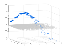
I’ve attached a few examples of how these algorithms can be used to imitate complex datasets, and a text file that contains the Octave code that will let you generate the datasets for yourself. Any point that fails to categorize is painted grey and mapped to the 0-plane. All points that categorize successfully are painted blue.

1. The Cylindrical “Flower Pot”

In this example, I’ve used a built-in Octave function to produce a three-dimensional surface that looks a bit like a flower pot. I then take the underlying point information, process it using the generate_data_tree function, which repeatedly categorizes the point information as if it were a dataset, and then imitate that dataset using the imitate_data function. The results are pretty awesome, and clearly reproduce the overall three-dimensional shape of the surface.

The first attached image shows the original surface, the second image shows the imitated surface generated by the imitate_data function, and the third image shows the top-level categories generated by the categorization algorithm. Proximate ‘o’ rings painted the same color are part of the same category. Large rings are part of a large category, and small rings are part of a small category.

Though this is just a surface, in theory, these algorithms could reproduce both the surface, and the internal structure of a three-dimensional object, suggesting that these algorithms might have applications in 3D printing, autocad, etc.

2. The Noisy Sine Wave

This is a noisy, discontinuous sine curve that I then reproduced using the imitate_data function. Macroscopically, the reproduction almost looks smooth, but up close you can quite plainly see that the algorithm reproduces not only the overall shape and specific values of the function, but also the patchiness of the domain and range of the function.

3. The Quadratic Plot

This is a simple quadratic curve that is smooth compared to the other functions.

The relevant scripts are here:

find_most_distant_pair

generate data samples

generate_categories_3d

generate_data_tree

generate_n_random_categories_3d

imitate_data

left_right_delta_3d

optimize_categories_3d

partition_array_3d

predict_best_fit_tree

shape_to_data

test_entropy_array_3d

display_categorization_3d